 |
 |
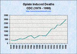
Source: Centers for Disease Control, CDC Wonder System
|
|
|
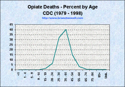
Two things should stand out to you about the charts above: the first, is the exponential increase in opiate-induced deaths from 1991 to 1998. The second is how closely the chart on the right maps to the "standard curve" of distributions about a mean. Since these deaths are accidental, it makes sense that the age at death chart would follow such a statistical average.
Categorizations and Mortality Figures for Opiate Induced Death
| Opiate Induced Deaths | ||||||
|---|---|---|---|---|---|---|
| 850.0 | ||||||
| Year | 304.0 | 304.7 | 305.5 | Number | % of total | Year Total |
| 1979 | 21 | 3 | 2 | 341 | 93 | 367 |
| 1980 | 11 | 1 | 1 | 322 | 96 | 335 |
| 1981 | 10 | 1 | 4 | 405 | 96 | 420 |
| 1982 | 12 | 1 | 4 | 559 | 97 | 576 |
| 1983 | 13 | 1 | 7 | 503 | 96 | 524 |
| 1984 | 14 | 0 | 9 | 628 | 96 | 651 |
| 1985 | 9 | 0 | 11 | 867 | 98 | 887 |
| 1986 | 13 | 0 | 12 | 930 | 97 | 955 |
| 1987 | 25 | 1 | 11 | 595 | 94 | 632 |
| 1988 | 14 | 1 | 10 | 798 | 97 | 823 |
| 1989 | 24 | 0 | 12 | 957 | 96 | 993 |
| 1990 | 17 | 0 | 13 | 931 | 97 | 961 |
| 1991 | 29 | 2 | 20 | 872 | 94 | 923 |
| 1992 | 23 | 0 | 42 | 1,279 | 95 | 1,344 |
| 1993 | 21 | 1 | 42 | 1,728 | 96 | 1,792 |
| 1994 | 15 | 0 | 77 | 1,732 | 95 | 1,824 |
| 1995 | 31 | 1 | 148 | 2,118 | 92 | 2,298 |
| 1996 | 34 | 0 | 155 | 2,075 | 92 | 2,264 |
| 1997 | 36 | 0 | 191 | 2,377 | 91 | 2,604 |
| 1998 | 25 | 1 | 203 | 2,718 | 92 | 2,947 |
| Grand Total | 397 | 14 | 974 | 22,735 | 94 | 24,120 |
Since 94 percent of opiate induced deaths over the 20 years were caused by accidental poisoning, it makes sense that the age distribution of victims would follow the statistical standard curve. But how do we explain the sudden increase in deaths from 1991 to 1998? Perhaps this will help to explain the situation:
 |
|
| truth: the Anti-drugwar | Anti-drugwar Arsenal | Accept the $1 Challenge |